Production Blog- Its Coming Together
Hey everyone, welcome back to the blog! Today's blog is going to be all about how the past weekend went on production. So, I'm going to start off with the "bad" news and then the good, this past week has brought me nothing but rain and fog. No progress has been able to be made in the filming of the first clip in the storyboard due to the weather. That's a little unfortunate however, other progress has been made. I filmed the clip I wanted of myself climbing and it went very well, it only took me a few attempts with a tripod to capture the jump I was doing on the climbing wall. For this clip though I had a wardrobe change, I went with a white tank-top and grey shorts instead of the previous plan due to how hot it was in the gym and I didn't want to take the risk of overheating while filming. I also tweaked the theme for the commercial a tiny bit. The commercial will now be both an outdoorsy vibe along with a vintage film look. I chose this because these two things just work super well together and it just looks more cinematic. In the editing phase I did exactly what I said I would and I added a nice transition from landscape to portrait in the commercial. I am really happy with how it turned out it flows every nicely and it's easy on the eyes. For the transition all I did was add a film burn effect over the switch from landscape to portrait and it works very nicely. This coming week is expected to be sunny and clear in the sky so I am going to take this opportunity to film the establishing shot while I can. I decided that I want my commercial to be around 45 seconds of runtime, I don't want it too long but I cant shorten it without removing important parts of videos I included. Next time I am going to spend most of my time adding the finishing touches to the commercial while I edit. But before I get to that I made sure to start my title card and my credits. My credits are simple, I credited the artist who's music I used and myself for the production. The text is a simple handwritten font to match the theme and the text is also italicized to seem fancier than it really is. Along with that I have started the color grading process so I can achieve the final look I am searching for. But that's all I had time for this weekend, and for this recap. Thank you all for reading!
It was a pleasure, goodbye.
ANTON F
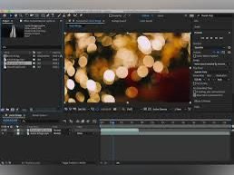
( A picture with the color grade I have started)


Comments
Post a Comment